library(tidyverse)
library(lterdatasampler)Workshop date: Friday 17 April
1. Summary
Packages
tidyverselterdatasampler
Operations
New functions
- display data from package using
data() - visualize QQ plots using
geom_qq()andgeom_qq_line() - create multi-panel plots using
facet_wrap() - compare group variances using
var.test() - do t-tests using
t.test()
Review
- chain functions together using
|> - filtering observations using
filter() - manipulate columns using
mutate()andcase_when() - visualize data using
ggplot() - create boxplots using
geom_boxplot()and show observation values usinggeom_jitter() - create histograms using
geom_histogram() - use
geom_pointrange()to show means and 95% CI - group data using
group_by() - undo grouping using
ungroup() - summarize data using
summarize()
General Quarto formatting tips
You can control the appearance of text, links, images, etc. using this guide.
Data source
The data on sugar maples is from the lterdatasampler package. The package developers (alumni of the Bren Masters of Environmental Data Science program!) curated a bunch of datasets from the LTER network into this package for teaching and learning. Read about the package here.
The source of the data is Hubbard Brook Experimental Forest. Read more about the data here.
2. Code
Remember to set up an Rproject before starting!
1. Set up
Packages
Insert a code chunk below to read in your packages. Name the code chunk packages.
Data
Because we are using data from the package lterdatasampler, we don’t need to use read_csv().
Instead, we can use data() to make the data frame show up in the environment.
Insert a code chunk below to display hbr_maples in the environment using data("hbr_maples"). Name the code chunk data.
data("hbr_maples")Variables
year: year of observationwatershed: reference (Reference) and calcium-treated (W1)elevation: elevation of watershed (Low or Mid)transect: location of the sampling points within the watershedsample: ID number of individualstem_length,leaf1area,leaf2area,leaf_dry_mass,stem_dry_mass: physical characteristics measured for each sugar maple seedling
Columns we’re interested in working with are year, watershed, and stem_length.
Each row represents the measurements taken from a single sugar maple seedling.
2. Cleaning and wrangling
Insert a code chunk to:
- create a new object from
hbr_maplescalledmaples_2003 - filter observations to only include maples measured in 2003
- mutate the
watershedcolumn so thatW1is filled in asCalcium-treated - select the columns of interest
Name the code chunk data-cleaning.
# creating a new object from hbr_maples
maples_2003 <- hbr_maples |>
  # filtering to only include observations from 2003
  filter(year == "2003") |>
  # renaming values in watershed column
  mutate(watershed = case_when(
    # when W1 appears, replace with Calcium-treated
    # keep all other values the same
    watershed == "W1" ~ "Calcium-treated",
    .default = watershed
  )) |>
  # selected the columns of interest
  select(year, watershed, stem_length)
3. Exploratory data visualization
Insert a code chunk to make a boxplot + jitter plot comparing stem lengths between watersheds. Remember to:
- color by watershed
- control the jitter so that the points don’t move up and down the y-axis
Name the code chunk boxplot-with-jitter.
# base layer: ggplot
ggplot(data = maples_2003, # starting data frame
       mapping = aes(x = watershed, # x-axis
                     y = stem_length, # y-axis
                     color = watershed)) + # coloring by watershed
  # first layer: boxplot
  geom_boxplot() +
  # second layer: jitter plot
  geom_jitter(height = 0, # making sure points don't move along y-axis
              width = 0.2) # narrowing width of jitter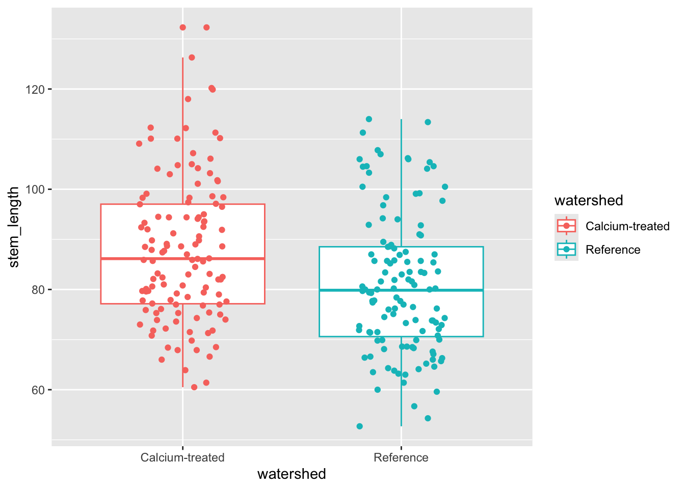
Median sugar maple seedling stem lengths seem to differ between watersheds.
4. Checks for t-test assumptions
a. Normally distributed response variable
Histogram
Insert a code chunk to create a histogram. Name the code chunk histogram.
Use facet_wrap() to create separate panels for each watershed.
# started with maples_2003 data frame
ggplot(data = maples_2003,
       # x-axis: stem length
       mapping = aes(x = stem_length)) +
  # first layer: histogram
  # bins from the Rice Rule
  geom_histogram(bins = 6) +
  # creating separate panels for each level in watershed
  facet_wrap(~ watershed)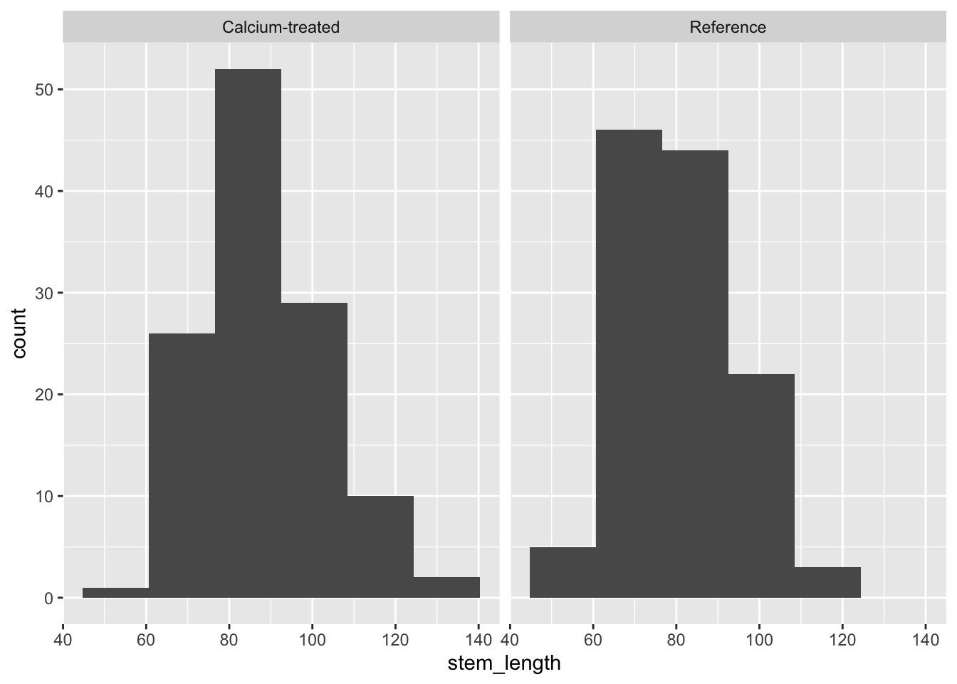
QQ plot
Insert a code chunk to create a QQ plot. Name the code chunk qq-plot.
Use facet_wrap() to create separate panels for each watershed.
# base layer: maples_2003 in ggplot
ggplot(data = maples_2003,
       # y-axis: sample quantiles of stem length
       mapping = aes(sample = stem_length)) +
  # first layer: reference for the QQ plot
  geom_qq_line(color = "blue") +
  # second layer: points representing sample quantiles
  # compared to quantiles in a normal distribution
  geom_qq() +
  # creates separate panels for calcium-treated and reference watersheds
  facet_wrap(~ watershed)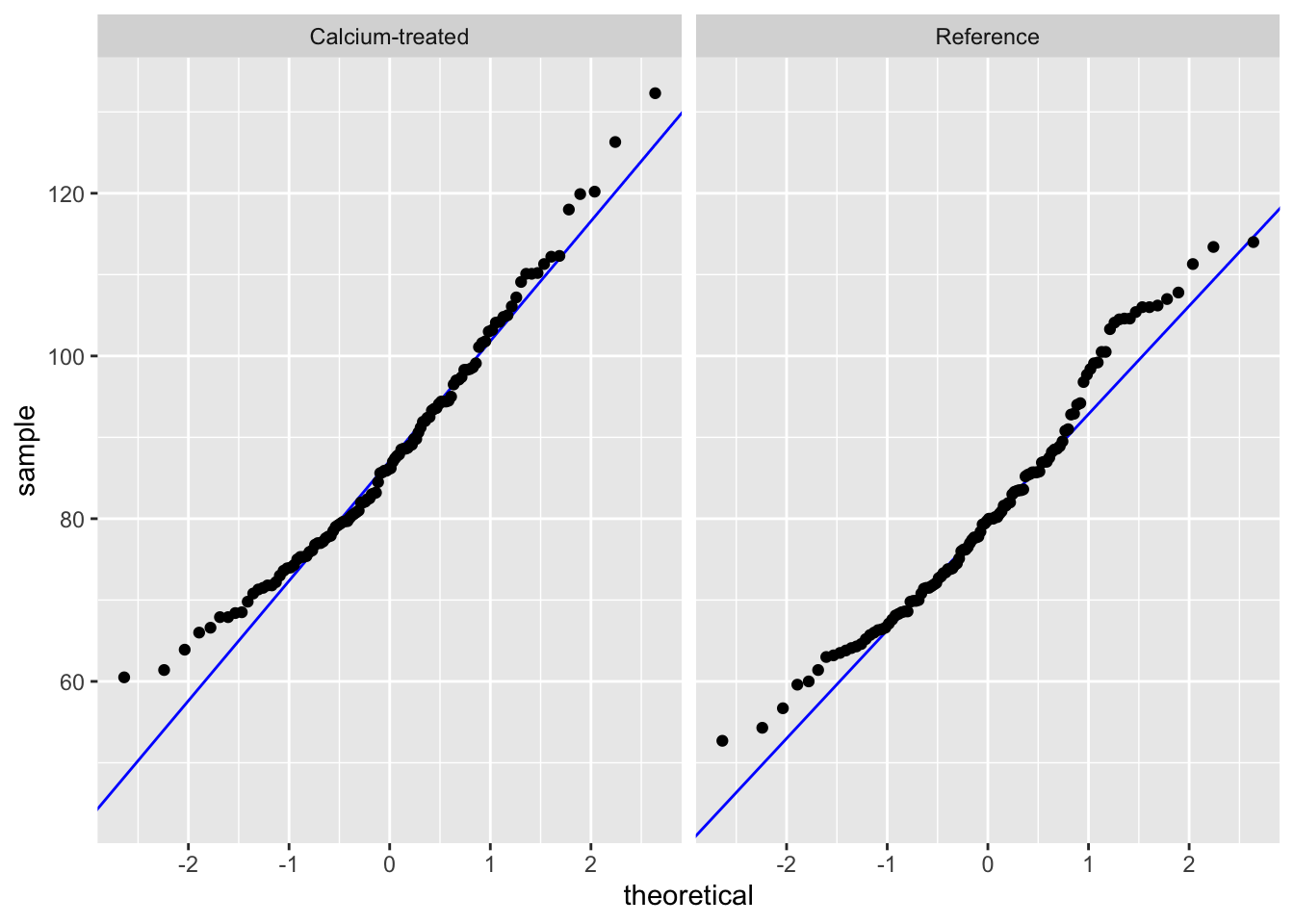
Check in: using histograms and QQ plots, does stem length seem to be normally distributed?
Because a) the distributions in the histogram look symmetrical and b) the QQ plot points follow the reference line comparing sample quantiles to theoretical (normal) quantiles, we can say that stem length seems to be normally distributed.
b. Equal variances
Next, we’ll check our variances.
Variance ratio by hand
We can make sure we know where the F test results are coming from by calculating the variance ratios ourselves.
# create new object from maples_2003
stem_length_var <- maples_2003 |>
  # group by watershed
  group_by(watershed) |>
  # calculate variances
  summarize(variance = var(stem_length)) |>
  # ungroup data frame
  ungroup()

# calculate variance ratio
# double check against results of var.test()
205.7026/194.3021
[1] 1.058674F-test of equal variances
Insert a code chunk to check the variances using var.test(). Name the code chunk F-test.
In the function var.test(), enter the arguments for:
- the formula
- the data
# doing F test of equal variances
var.test(
  # formula: response variable ~ grouping variable
  stem_length ~ watershed,
  # data: maples_2003 data frame
  data = maples_2003
)
    F test to compare two variances

data:  stem_length by watershed
F = 1.0587, num df = 119, denom df = 119, p-value = 0.7563
alternative hypothesis: true ratio of variances is not equal to 1
95 percent confidence interval:
 0.7378244 1.5190473
sample estimates:
ratio of variances
          1.058674
Remember that this variance test is an F test of equal variances. You are comparing the variance of one group with another.
To communicate about this, you could write something like:
Using an F-test of equal variances, we determined that variances were (equal or not equal) (F(num df, denom df) = F ratio, p-value).
We determined that group variances were (equal or not equal) (F-test of equal variances, F(num df, denom df) = F statistic, p-value).
Communicating about a variance check
We determined that group variances were equal (F-test of equal variances, F(119, 119) = 1.06, p = 0.76, \(\alpha\) = 0.05).
5. Doing a t-test
Insert a code chunk to do a t-test. Name the code chunk t-test.
In the function t.test(), enter the arguments for:
- the formula
- the variances in
var.equal =
- and the dataframe in
data =
t.test(
  # formula: response variable ~ grouping variable
  stem_length ~ watershed,
  # data: maples_2003 data frame
  data = maples_2003,
  # variances are equal (checked using F-test)
  var.equal = TRUE
)
    Two Sample t-test

data:  stem_length by watershed
t = 3.7797, df = 238, p-value = 0.0001985
alternative hypothesis: true difference in means between group Calcium-treated and group Reference is not equal to 0
95 percent confidence interval:
  3.304134 10.497532
sample estimates:
mean in group Calcium-treated       mean in group Reference
                     87.88583                      80.98500
6. Communicating
a. visual communication
When doing a t-test, remember that you are comparing means. To visualize the data in a way that reflects the values you are comparing (again, you are comparing means), you can visualize the means of each watershed with the standard deviation (spread), standard error (variation), or confidence interval (confidence).
In this example, we will show 95% confidence intervals.
In this code chunk, we are calculating the means and 95% confidence intervals. Name the code chunk ci-calculation.
# creating new object from maples_2003
maples_ci <- maples_2003 |>
  # group by watershed
  group_by(watershed) |>
  # calculations
  summarize(mean = mean(stem_length), # mean
            n = length(stem_length), # number of observations
            df = n - 1, # degrees of freedom
            sd = sd(stem_length), # standard deviation
            se = sd/sqrt(n), # standard error
            tval = qt(p = 0.05/2, df = df, lower.tail = FALSE), # t-value
            margin = tval * se, # margin of error
            ci_lower = mean - margin, # lower bound of the confidence interval
            ci_upper = mean + margin # upper bound of the confidence interval
          ) |>
  # ungrouping the data frame
  ungroup()
Before moving on, look at the maples_ci object to make sure you know what it contains.
Note that this visualization uses two data frames. We use maples_2003 to show the underlying data using geom_jitter(), and maples_ci to show the mean and 95% CI.
# base layer: starting with maples_2003
ggplot(data = maples_2003,
       # x-axis: watershed
       # y-axis: stem length
       # color geometries by watershed
       mapping = aes(x = watershed,
                     y = stem_length,
                     color = watershed)) +
  # first layer: jitter to represent individual sugar maple seedlings
  geom_jitter(height = 0,
              width = 0.1,
              alpha = 0.4,
              shape = 21) +
  # second layer: points and bars to represent means and 95% CI
  geom_pointrange(data = maples_ci,
                  mapping = aes(x = watershed,
                                y = mean,
                                ymax = ci_upper,
                                ymin = ci_lower)) +
  # relabelling the x- and y-axes
  labs(x = "Watershed",
       y = "Stem length (cm)") +
  # using custom colors
  scale_color_manual(
    values = c(
      "Calcium-treated" = "darkorchid3",
      "Reference" = "tomato3"
    )
  ) +
  # using a different theme from the default
  theme_bw() +
  # taking out the legend
  theme(legend.position = "none")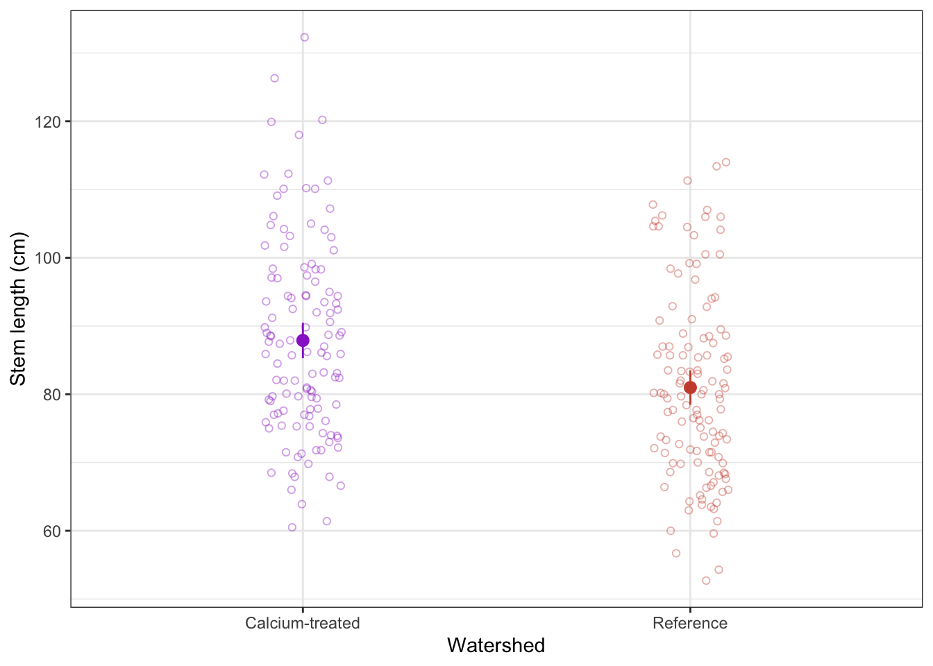
b. Writing
Summarize the results of the t-test in one sentence. Before you do, make sure you know the:
type of test
Student’s t-test (note: this is because variances are equal)
sample size
n = 120 for calcium-treated, n = 120 for reference (240 total)
sample means
87.9 cm for calcium treated, 81.0 cm for reference
significance level
\(\alpha\) = 0.05
distribution
t distribution
degrees of freedom
238 (note: 240 - 2 = 238)
t-value (aka t-statistic)
3.8
p-value
p < 0.001 (don’t need to give exact number of any p-value below 0.001)
Results summary
We found a significant difference in sugar maple stem lengths between calcium-treated (n = 120, mean = 87.9 cm) and reference watersheds (n = 120, mean = 81.0 cm) (Student’s t-test, t(238) = 3.8, p < 0.001, \(\alpha\) = 0.05).
3. Extra stuff
Setting global options for code execution
If you want any messages to be hidden in your rendered Quarto document, then you can adjust the YAML at the top of the document. This is the section that has 3 dashes at the beginning and end (where you enter your name, the date, and your execution option).
The YAML controls the aesthetics of the rendered doc (or PDF, or HTML) that is created from your Quarto document. See more details here and here from the Quarto user manual.
To adjust the YAML for a .qmd file for which you want all messages to be hidden, you can add the following lines to the YAML:
execute:
  message: false
So the complete YAML for workshop 3, for example, would look something like this:
---
title: "Week 3 workshop: sugar maples"
author: "An Bui"
format: docx
execute:
  message: false
---
Indentations matter!
When adjusting settings in the YAML, you need to be very careful about the indentations. The YAML code as written above will work, but YAML code written without the tab before message (example below) will not.
---
title: "Week 3 workshop: sugar maples"
author: "An Bui"
format: docx
execute:
message: false
---