# load in packages
library(tidyverse)
library(janitor)Workshop date: Friday 10 April
1. Summary
Packages
tidyversejanitor
Operations
- read in data using
read_csv() - chain functions together using
|> - clean column names using
clean_names() - create new columns using
mutate() - select columns using
select() - make data frame longer using
pivot_longer() - group data using
group_by() - undo grouping using
ungroup() - summarize data using
summarize() - calculate standard deviation using
sd() - calculate t-values using
qt() - visualize data using
ggplot() - create histograms using
geom_histogram() - visualize means and raw data using
geom_point() - visualize standard deviation, standard error, and confidence intervals using
geom_errorbar()andgeom_pointrange() - visualize trends through time using
geom_point()andgeom_line()
Data source
This week, we’ll work with data on seafood production types (aquaculture or capture). This workshop’s data comes from Tidy Tuesday 2021-10-12, which was from OurWorldinData.org.
2. Code
1. Set up
This section of code includes reading in the packages you’ll need: tidyverse and janitor.
You’ll also read in the data using read_csv() and store the data in an object called production.
# read in data
production <- read_csv("captured_vs_farmed.csv")
Note
Remember to look at the data before working with it! You can use View(production) in the console, or click on the production object in the Environment tab in the top right.
Before you start: think about what the differences might be between aquaculture and capture production in the context of fisheries. Which production type do you think would produce more seafood?
insert your best guess here
2. Cleaning up
The data comes in what’s called “wide format”, meaning that each row represents multiple observations. For example, the first row contains the production from Afghanistan (country code AFG) in 1969 for aquaculture and capture production.
We want to convert the data into “long format” so that it’s easier to work with. A dataset is in long format if each row represents an observation.
In this chunk of code, we’ll:
- clean the column names using
clean_names()
- filter to only include the “entity” we want using
filter()
- select the columns of interest using
select()
- make the data frame longer using
pivot_longer()
- manipulate the
typecolumn to change the long names (e.g.aquaculture_production_metric_tons) to short names (e.g.aquaculture) usingmutate()andcase_when()
- use
mutate()to create a new column calledmetric_tons_mil
# creating new object from production
production_clean <- production |>
  # clean column names
  clean_names() |>
  # filter to only include observations from the US
  filter(entity == "United States") |>
  # select columns of interest
  select(year,
         aquaculture_production_metric_tons,
         capture_fisheries_production_metric_tons) |>
  # choose columns to pivot
  pivot_longer(cols = aquaculture_production_metric_tons:
                 capture_fisheries_production_metric_tons,
               # column with fishery type should be named "type"
               names_to = "type",
               # column with catch amount should be named "catch_metric_tons"
               values_to = "catch_metric_tons") |>
  # mutate the existing type column
  mutate(type = case_when(
    # fill in aquaculture to replace aquaculture_production_metric_tons
    type == "aquaculture_production_metric_tons" ~ "aquaculture",
    # fill in capture to replace capture_fisheries_production_metric_tons
    type == "capture_fisheries_production_metric_tons" ~ "capture"
  )) |>
  # convert catch in metric tons to millions
  mutate(metric_tons_mil = catch_metric_tons/1000000)
3. Making a boxplot/jitter plot
Last week in workshop, we made a boxplot. The boxplot shows useful summary statistics (displays the central tendency and spread), while the jitter plot shows the actual observations (in this case, each point is the catch for a fishery in a given year). One way to display the underlying data is to combine a boxplot with a jitter plot.
# start with the production_clean data frame
ggplot(data = production_clean,
       # x-axis should be type of production
       # y-axis should be metric tons of production (in millions)
       # coloring by production type
       mapping = aes(x = type,
                     y = metric_tons_mil,
                     color = type)) +
  # first layer: boxplot
  geom_boxplot() +
  # second layer: jitter
  geom_jitter(width = 0.2, # making the points jitter horizontally
              height = 0) + # making sure points don't jitter vertically
  # relabelling x- and y-axes
  labs(x = "Type",
y = "Metric tons of production (in millions)") 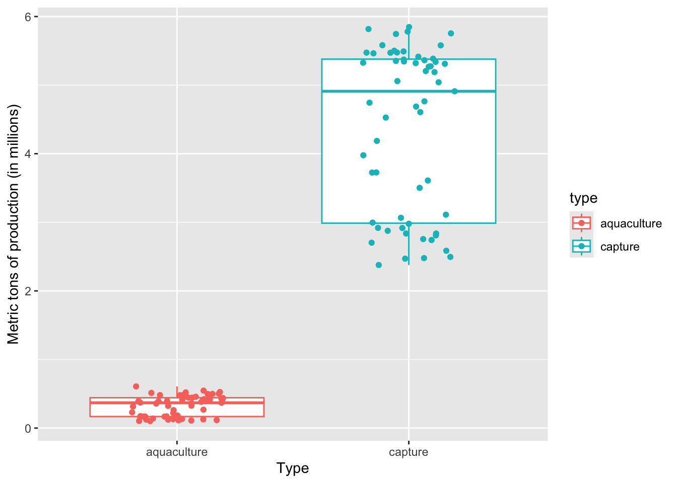
On average, a) which type of production produces more fish, and b) what components of the plot are you using to come up with your answer?
a) Capture production, because b) the median of the boxplot is way higher than the median for aquaculture
4. Making a histogram
This chunk of code creates a histogram. Note that for a histogram, you only need to fill in the aes() argument for the x-axis (x), not the y-axis. This is because ggplot() counts the number of observations in each bin for you.
Within the geom_histogram() call, you’ll need to tell R what number of bins you want using the bins argument. In this case (using the Rice Rule to determine the appropriate number of bins), we’ll use 10 bins.
# base layer: ggplot
ggplot(data = production_clean,
       # x-axis should be metric_tons_mil
       # fill by production type (aquaculture or capture)
       mapping = aes(x = metric_tons_mil,
                     fill = type)) +
  # first layer: histogram
  geom_histogram(bins = 10, # set the number of bins based on Rice Rule
                 color = "black") # make the border of the columns black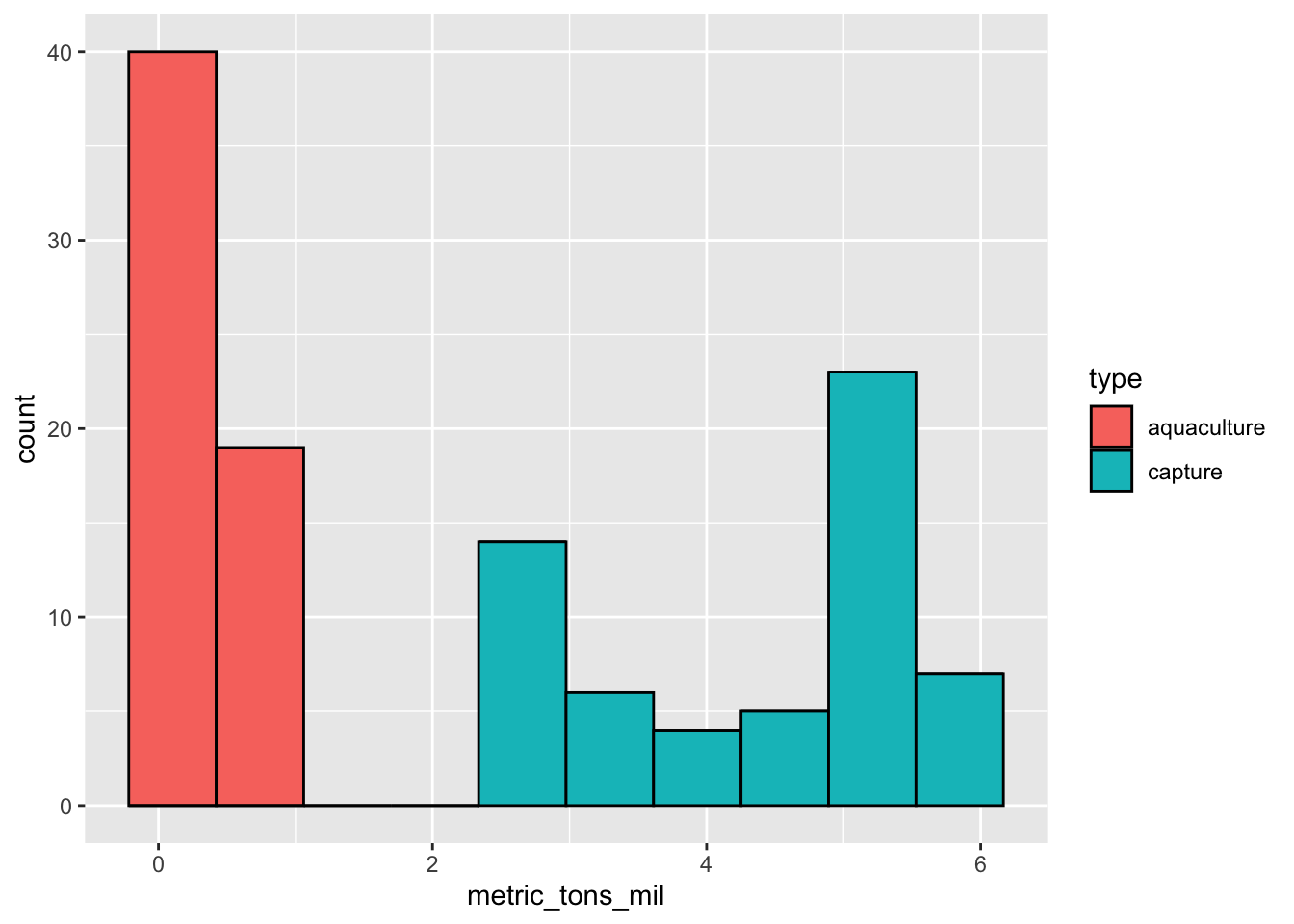
Can you tell from looking at the histogram which production type tends to produce more fish? Why or why not?
Yes. There are no observations for aquaculture at high catch (in millions); most of the observations for aquaculture are lower than 1 million tons, while capture production ranges up to 6 million tons.
5. Visualizing spread, uncertainty, and confidence
a. Calculations
# create a new object from clean data frame
production_summary <- production_clean |>
  # group by production type
  group_by(type) |>
  # calculate values for each production type
  summarize(
    mean = mean(metric_tons_mil), # mean
    n = length(metric_tons_mil), # number of observations (n)
    df = n - 1, # degrees of freedom
    sd = sd(metric_tons_mil), # standard deviation
    se = sd/sqrt(n), # standard error
    tval = qt(p = 0.05/2, df = df, lower.tail = FALSE), # t value
    margin = tval*se, # margin of error
    ci_lower = mean - margin, # lower bound of the confidence interval
    ci_higher = mean + margin # upper bound of the confidence interval
  )

# display object
production_summary
# A tibble: 2 × 10
type mean n df sd se tval margin ci_lower ci_higher
<chr> <dbl> <int> <dbl> <dbl> <dbl> <dbl> <dbl> <dbl> <dbl>
1 aquaculture 0.324 59 58 0.149 0.0194 2.00 0.0389 0.285 0.363
2 capture 4.38 59 58 1.20 0.156 2.00 0.313 4.07 4.69 How could you write about these confidence intervals?
Mean production in US aquaculture is 0.32 million metric tons [95% CI: 0.29, 0.36], while mean capture production is 4.38 million metric tons [95% CI: 4.07, 4.69].
b. Visualizations
When visualizing the central tendency (in this case, mean) and spread (standard deviation) or uncertainty (standard error) or confidence (confidence intervals), you can stack geoms on top of each other.
To visualize the mean, we’ll use geom_point(). Remember that geom_point() can be used for any plot you want to make that involves a point.
To visualize the spread/uncertainty/confidence, we’ll use geom_errorbar(). This is the geom that creates two lines that can extend away from a point.
Standard deviation
First, we’ll visualize standard deviation.
# base layer: ggplot
ggplot(data = production_summary,
       # x-axis should be production type
       # y-axis is mean production
       # color by production type
       mapping = aes(x = type,
                     y = mean,
                     color = type)) +
  # first layer: points to represent mean
  geom_point(size = 2) +
  # second layer: bars to represent standard deviation
  geom_errorbar(mapping = aes(ymin = mean - sd,
                              ymax = mean + sd),
                width = 0.1) + # make the bars narrower
  # relabelling x- and y-axes, adding title
  labs(title = "Standard deviation",
       x = "Type",
       y = "Mean and SD million metric tons production")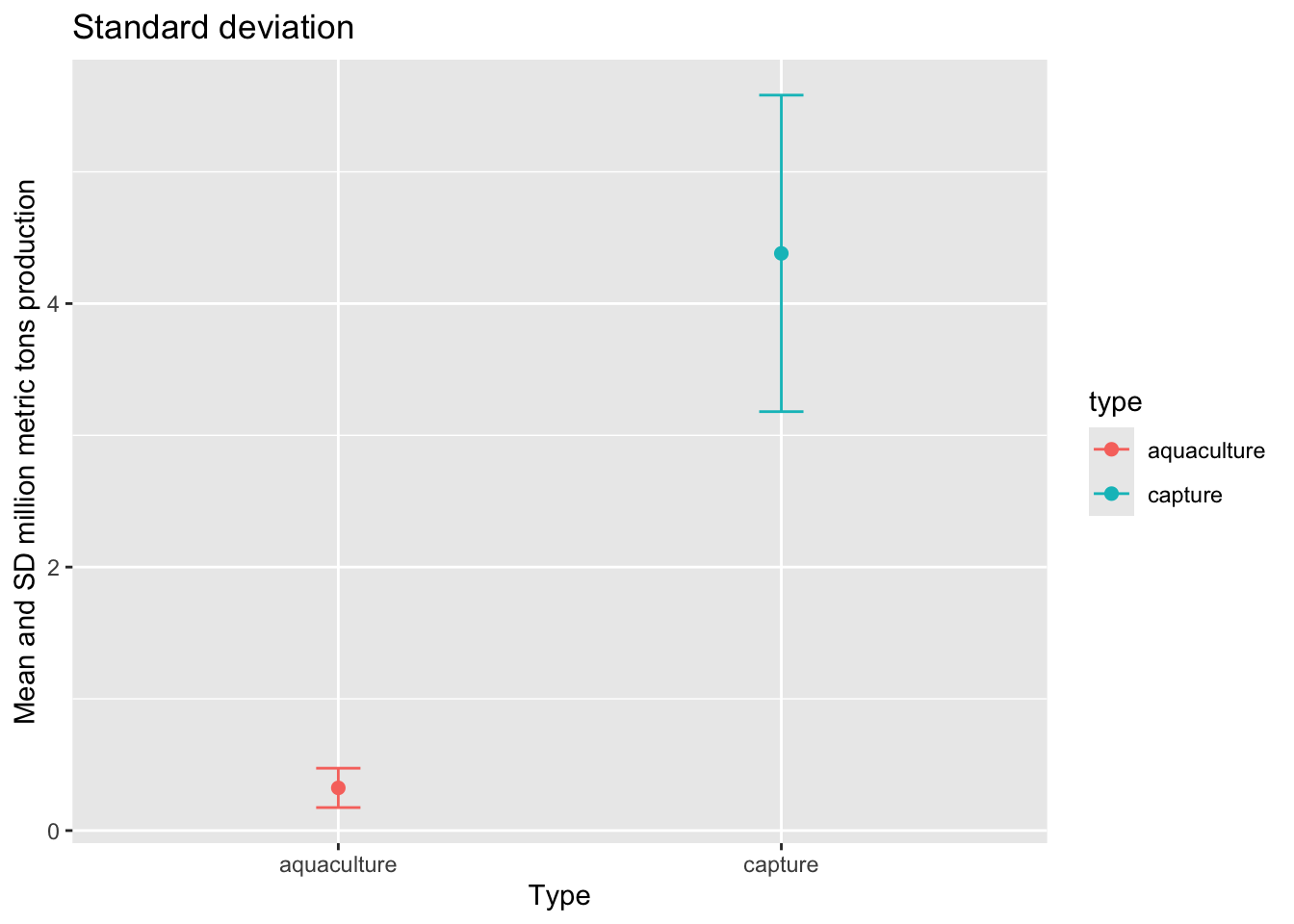
Standard error
Then, we want to visualize standard error.
# base layer: ggplot
ggplot(data = production_summary,
       # x-axis should be production type
       # y-axis is mean production
       # color by production type
       mapping = aes(x = type,
                     y = mean,
                     color = type)) +
  # first layer: points to represent mean
  geom_point(size = 2) +
  # second layer: bars to represent standard error
  geom_errorbar(mapping = aes(ymin = mean - se,
                              ymax = mean + se),
                width = 0.1) + # make the bars narrower
  # relabelling x- and y-axes, adding title
  labs(title = "Standard error",
       x = "Type",
       y = "Mean and SE million metric tons production")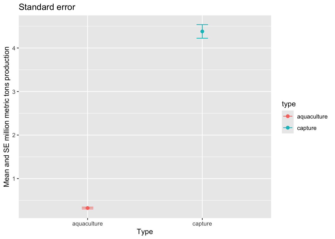
95% confidence interval
Then, we want to visualize the 95% confidence interval.
# base layer: ggplot
ggplot(data = production_summary,
       # x-axis should be production type
       # y-axis is mean production
       # color by production type
       mapping = aes(x = type,
                     y = mean,
                     color = type)) +
  # first layer: points to represent mean
  geom_point(size = 2) +
  # second layer: bars to represent 95% CI
  geom_errorbar(mapping = aes(ymin = ci_lower,
                              ymax = ci_higher),
                # make the bars narrower
                width = 0.1) +
  # relabelling x- and y-axes, adding title
  labs(title = "Confidence interval using geom_point and geom_errorbar",
       x = "Type",
       y = "Mean and 95% CI million metric tons production")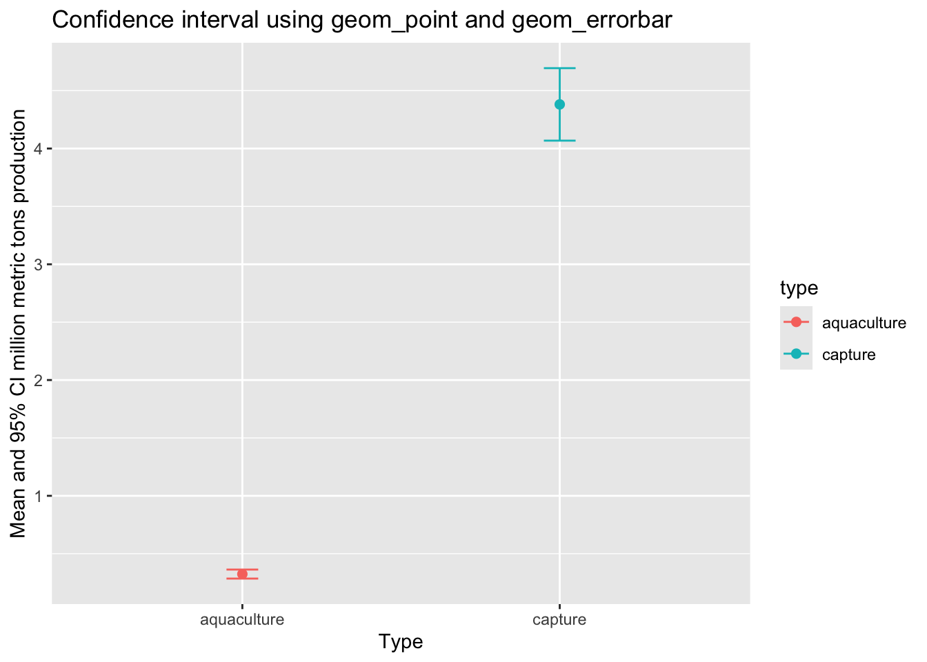
c. geom_pointrange()
We can also visualize means and spread/uncertainty/confidence intervals using the geom_pointrange() function.
# base layer: ggplot
ggplot(data = production_summary,
       # x-axis should be production type
       # y-axis is mean production
       # color by production type
       mapping = aes(x = type,
                     y = mean,
                     color = type)) +
  # first layer: points representing mean,
  geom_pointrange(mapping = aes(ymin = ci_lower,
                                ymax = ci_higher)) +
  # relabelling x- and y-axes, adding title
  labs(title = "Confidence interval (using geom_pointrange)",
       x = "Type",
       y = "Mean and 95% CI million metric tons production")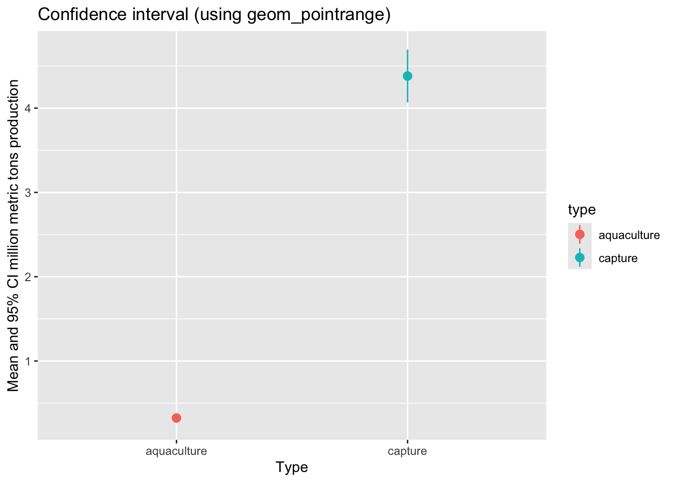
d. Visualizing with the underlying data
Lastly, we want to visualize the 95% confidence interval with the underlying data.
# base layer: ggplot
ggplot(data = production_clean,
       mapping = aes(x = type,
                     y = metric_tons_mil,
                     color = type)) +
  # first layer: adding data (each point shows an observation)
  geom_jitter(width = 0.1,
              height = 0,
              alpha = 0.4,
              shape = 21) +
  # second layer: means and 95% CI
  geom_pointrange(data = production_summary,
                  mapping = aes(x = type,
                                y = mean,
                                ymin = ci_lower,
                                ymax = ci_higher)) +
  # custom colors
  scale_color_manual(values = c("aquaculture" = "deepskyblue",
                                "capture" = "orangered")) +
  # relabelling x- and y-axes, adding title
  labs(x = "Production type",
       y = "Million metric tons of production",
       title = "Capture produces more than aquaculture") +
  # custom theme
  theme_light() +
  # taking out legend
  theme(legend.position = "none")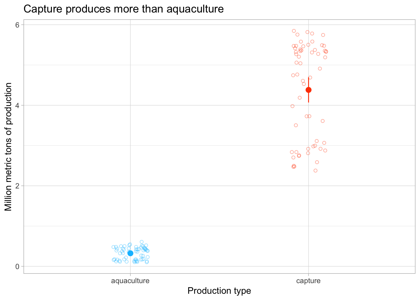
ggplot themes
There are lots of themes in ggplot to play around with. These are nice to use to get rid of the grey background that is the default, and generally make your plot look cleaner.
A list of built-in themes and their theme_() function calls is here.
e. Visualizing through time
Then, if we want to visualize production through time:
# base layer: ggplot
ggplot(data = production_clean,
       # x-axis should be year, y-axis should be metric tons in millions
       # color and shape by production type
       mapping = aes(x = year,
                     y = metric_tons_mil,
                     color = type,
                     shape = type)) +
  # first layer: points
  geom_point() +
  # second layer: lines
  geom_line() +
  # manually set colors
  scale_color_manual(values = c("aquaculture" = "deepskyblue",
                                "capture" = "orangered")) +
  # relabel x- and y-axes, legend title
  labs(x = "Year",
       y = "Million metric tons of production",
       color = "Production type",
       shape = "Production type") +
  # custom theme
  theme_minimal()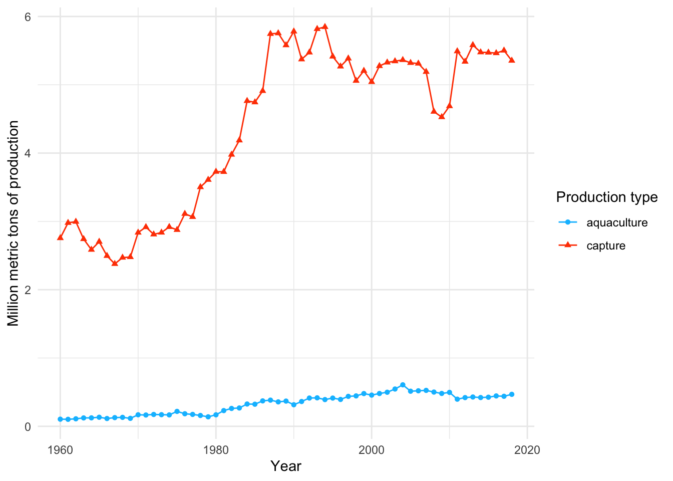
END OF WORKSHOP 2
3. Extra stuff
Shapes in figures
In class, we used shape = 21 in the geom_point() call to make the points show up as open circles. By default, ggplot() uses shape = 16 for all geometries that include points.
This figure below shows the 26 options for shapes you can use in any plot with a point geometry.
Shapes 0-14 are only outlines (with a transparent fill). Shapes 15 - 20 are filled (no outline). This means you control them with color in the aes() function, and scale_color_() functions. These show up in pink in the plot below.
Shapes 21 - 25 include outlines and fills. You can manipulate both: you can change the outline using color and scale_color_() functions, and change the fill with fill and scale_fill_() functions. In the plot, outlines show up in pink and fills show up in yellow.
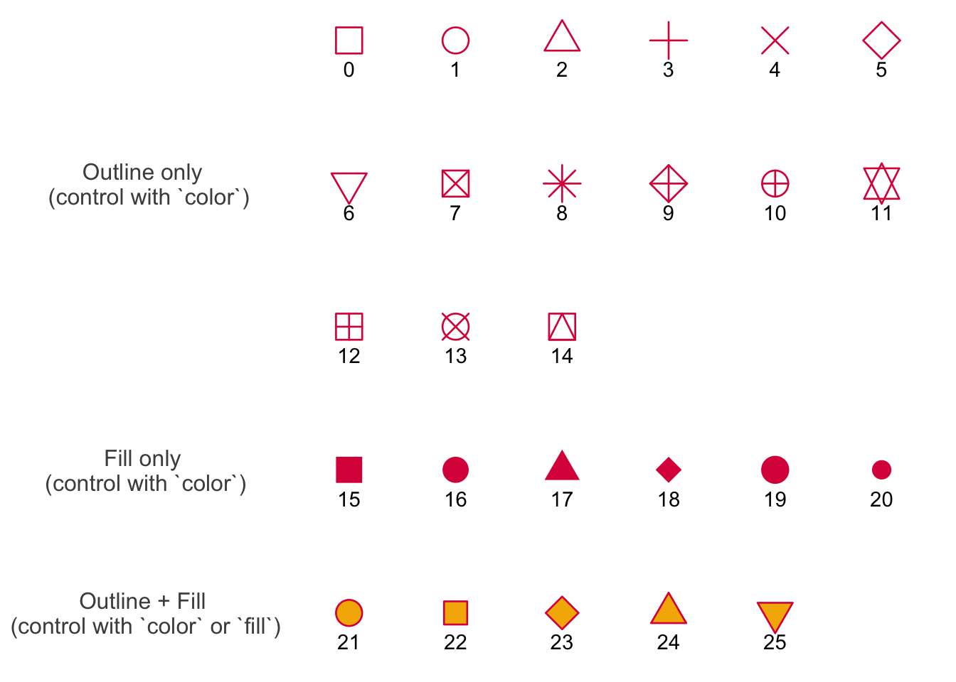
Credit to Albert Kuo’s blog post for inspiring me to make my own reference figure, and Alex Phillips’s colorblind friendly schemes for the colors in the figure.
Overlapping histograms
In class, we created a histogram that combined the distributions of metric tons of production for two groups: capture and aquaculture production.
I got a question about what a histogram would look like if there was overlap in the distributions of groups, and wanted to demonstrate visually what that would look like.
Here, I’m generating a data frame with fake values from distributions that have different means but overlapping spread:
set.seed(1)

# creating a data frame
test_df <- tibble(
  # generating fake values
  a = rnorm(n = 50, mean = 30, sd = 10),
  b = rnorm(n = 50, mean = 40, sd = 10)
) |>
  # making data frame longer
  pivot_longer(
    cols = a:b,
    names_to = "group",
    values_to = "value"
  )
Then, we can compare the histograms if they are stacked (on the left) and separate (on the right):
Stacked histograms:
# base layer: ggplot
ggplot(data = test_df,
       # only supplying x-axis value
       # filling by group
       mapping = aes(x = value,
                     fill = group)) +
  # first layer: histogram
  geom_histogram(bins = 9,
                 color = "black") +
  # creating different panels for each group
  facet_wrap(~ group) +
  # edits to y-axis to get rid of space between bottom of columns and x-axis
  # changing y-axis limits
  # making y-axis breaks smaller to make it easier to see frequencies
  scale_y_continuous(expand = c(0, 0),
                     limits = c(0, 36),
breaks = seq(from = 0, to = 36, by = 3)) 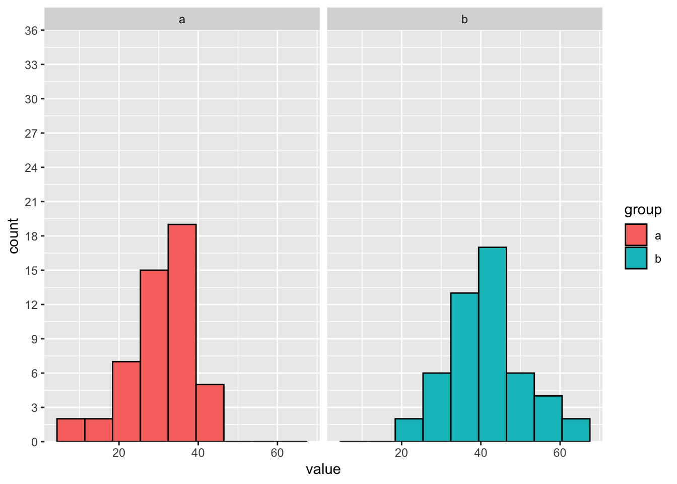
Separate histograms:
# base layer: ggplot
ggplot(data = test_df,
       # only supplying x-axis value
       # filling by group
       mapping = aes(x = value,
                     fill = group)) +
  # first layer: histogram
  geom_histogram(bins = 9,
                 color = "black") +
  # creating different panels for each group
  # facet_wrap(~ group) +
  # edits to y-axis to get rid of space between bottom of columns and x-axis
  # changing y-axis limits
  # making y-axis breaks smaller to make it easier to see frequencies
  scale_y_continuous(expand = c(0, 0),
                     limits = c(0, 36),
breaks = seq(from = 0, to = 36, by = 3)) 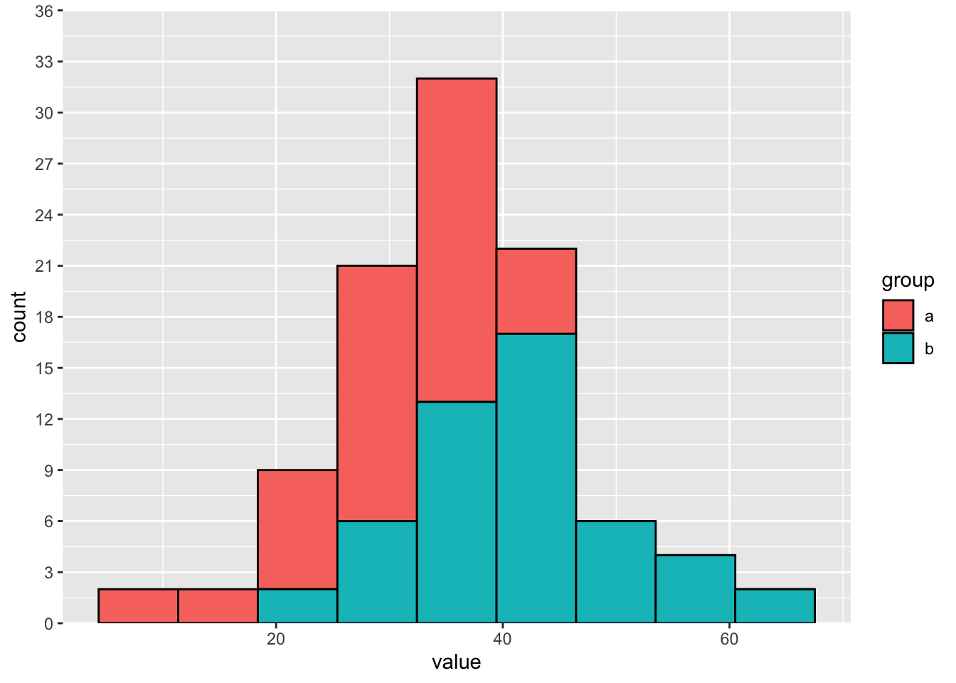
If the distributions overlap, then the counts stack on top of each other.