Why do we care about how plots, figures, graphs, etc. look?
Data visualization is a huge part of data storytelling, one of the core parts of being a data scientist. This is especially relevant to environmental science: you’re responsible for communicating not just about the environment, but what evidence (i.e. data) supports your claim. Therefore, it is crucial that environmental scientists communicate about their data clearly and effectively.
In this class, your plots will be assessed using three (very broad) criteria:
1. accuracy: is your plot accurately and truthfully representing the data?
2. clarity: is your plot clearly representing a pattern, relationship, message?
3. aesthetics: does your plot look good?
General rules for good-looking plots
(adapted from Allison Horst)
Non-negotiable (if you are missing these, you will not get full credit for your plot)
Axes must have complete labels with units (very few exceptions to this)
for example: body_mass_g should be “Body mass (g)”
Underlying data must always be shown if there is any summary (e.g. mean or median) or model prediction shown
Underlying data should be displayed in such a way that points can be distinguished (you can do this with transparency and/or modifying the shape type)
Colors must be different from the ggplot defaults
theme must be different from the ggplot defaults
your plot size should allow for all components of your plot (title, axis text, legend, etc.) to be visible and readable
Additional points
logical start and end values of x or y axes (these are usually by default in ggplot, but you should double check)
text labels should be large enough to see/read clearly
be aware of color-blind friendly color palettes
use one font throughout a plot
In general, the simpler you can make a plot, the better.
Bad/better examples
Some examples of bad and better plots follow using data from the {lterdatasampler} package.
Bar chart
Code
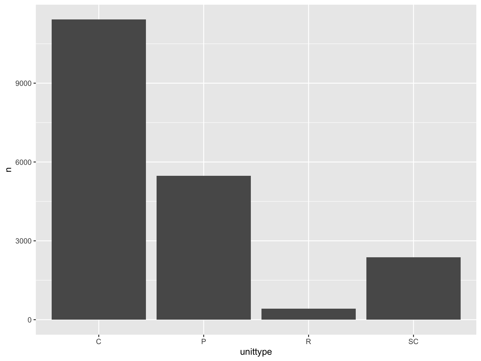
and_vertebrates |># filter for cutthroat trout and cascade/pool/side channel/rapid locationfilter(species =="Cutthroat trout"& unittype %in%c("C", "P", "SC", "R")) |># group by locationgroup_by(unittype) |># count number of observationscount() |># plot bar chart of number of observations by unittypeggplot(mapping =aes(x = unittype,y = n)) +geom_col()
Why is this bad?
gap between bottom of bars and x-axis
meaningless y axis
gray background against gray bars and black text is hard to see
gridlines don’t do much
Code
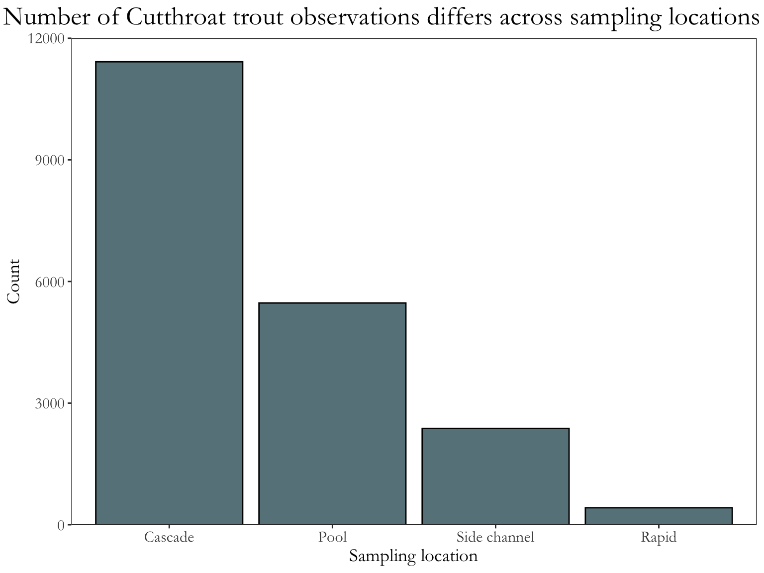
and_vertebrates |># same filtering and summarizing steps as abovefilter(species =="Cutthroat trout"& unittype %in%c("C", "P", "SC", "R")) |>group_by(unittype) |>count() |>ungroup() |># mutating unittype column to have full names of locationsmutate(unittype =recode_values( unittype,"C"~"Cascade","P"~"Pool","SC"~"Side channel","R"~"Rapid" )) |># plot bar chart of number of observations by unittype# reorder() in aes() reorders x-axis in order of descending n (count)ggplot(mapping =aes(x =reorder(unittype, -n),y = n)) +geom_col(fill ="lightblue4", color ="#000000") +# expand takes away the gap at the bottom and at the top of the plot# limits sets the limits of the axisscale_y_continuous(expand =c(0, 0), limits =c(0, 12000)) +# change titles to be meaningfullabs(x ="Sampling location", y ="Count",title ="Number of Cutthroat trout observations differs across sampling locations") +# one of the built-in themes in ggplottheme_bw() +theme(# changing text sizesaxis.text =element_text(size =12),axis.title =element_text(size =14),strip.text =element_text(size =14),# getting rid of gridlinespanel.grid =element_blank(),# making the plot title bigger and centering itplot.title =element_text(size =20, hjust =0.5),plot.title.position ="plot",text =element_text(family ="Garamond") )
Why is this better?
text is bigger
gridlines are gone (because the theme is different from the default)
easier to see columns against background
complete axes
x-axis labels are complete (“Cascade” instead of “C”)
fill is different from default (demonstrates some level of customization)
x-axis is reordered so that the differences across groups are easier to see
Scatterplot
Code
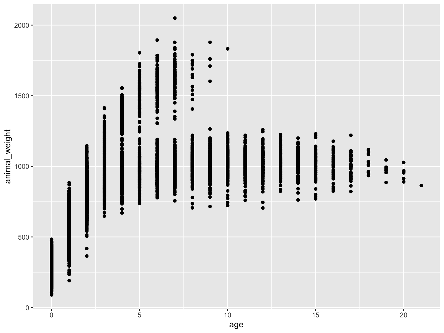
knz_bison |># calculate age of individualmutate(age = rec_year - animal_yob) |># plotting weight as a function of age ggplot(mapping =aes(x = age,y = animal_weight)) +# scatterplotgeom_point()
Why is this bad?
grey background, black dots
hides some meaningful variation across sexes (male bison tend to be larger than female bison, but female bison tend to live longer)
axes are meaningless
small text size
points likely overlap, so some parts of the data are hidden
Code
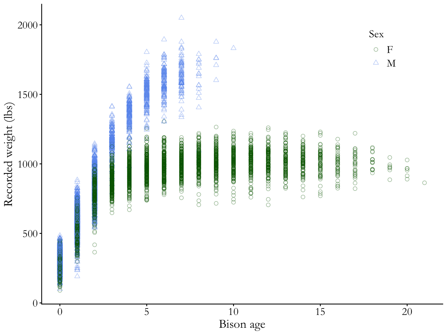
knz_bison |># calculate age of individualmutate(age = rec_year - animal_yob) |># plotting weight as a function of age # coloring and shaping points by sex (male or female)ggplot(mapping =aes(x = age,y = animal_weight,color = animal_sex, shape = animal_sex)) +# scatterplot# points are transparent and largegeom_point(alpha =0.4,size =2) +# manually setting open shapes and colorsscale_shape_manual(values =c(21, 24)) +scale_color_manual(values =c("darkgreen", "cornflowerblue")) +# relabelling axes and legend titlelabs(x ="Bison age",y ="Recorded weight (lbs)",color ="Sex",shape ="Sex") +# another ggplot built-in themetheme_classic() +theme(# putting legend in plot arealegend.position =c(0.85, 0.85),# legend text sizeslegend.text =element_text(size =14),legend.title =element_text(size =14),# text size, position, and font adjustmentaxis.text =element_text(size =14), axis.title =element_text(size =16),plot.title =element_text(size =18, hjust =0.5),plot.title.position ="plot",text =element_text(family ="Garamond") )
Why is this better?
white background, no grid lines
points are shaped and colored by sex (and larger overall), so you can easily see the differences between groups
transparency shows overlapping points
complete axis labels
text is larger and font is changed
legend is in plot area (if there’s space to do this, generally good)
Boxplots
Code
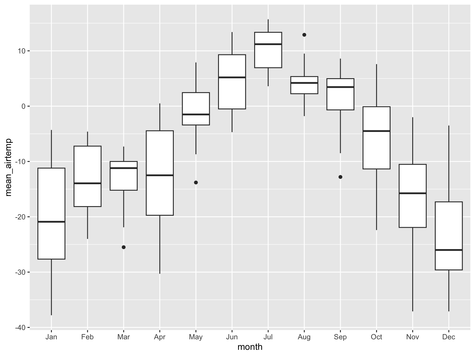
arc_weather |># extracting month from date columnmutate(month =month(date, label =TRUE)) |># filtering to only include dates from 2018filter(date >as.Date("2017-12-31")) |># plotting mean daily air temperatureggplot(mapping =aes(x = month,y = mean_airtemp)) +# boxplot (shows median mean daily air temperature)geom_boxplot()
Why is this bad?
grey background, black dots
doesn’t show the underlying data
y-axis is meaningless
small text size
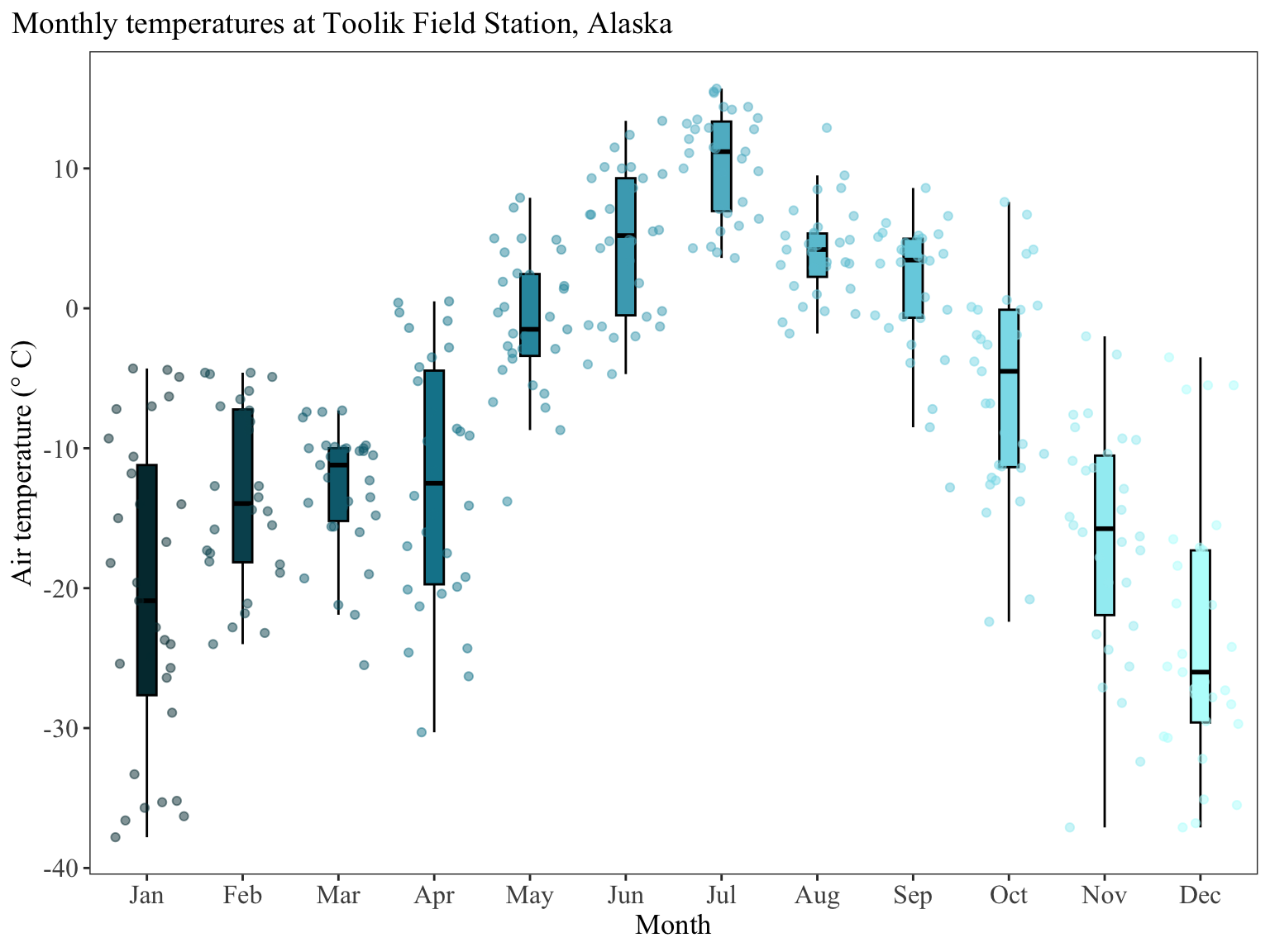
Code
arc_weather |># extracting month from date columnmutate(month =month(date, label =TRUE)) |># filtering to only include dates from 2018filter(date >as.Date("2017-12-31")) |># plotting mean daily air temperature# coloring and filling by monthggplot(mapping =aes(x = month,y = mean_airtemp,fill = month,color = month)) +# make the boxplots narrower# take out outliers (redundant if you are showing underlying data)# making the outlines black so that they are easier to seegeom_boxplot(width =0.2,outliers =FALSE,color ="black") +# showing the underlying data# making sure the points aren't jittered along the y-axisgeom_jitter(alpha =0.5,height =0,width =0.4) +# specify the colors you want to use for each monthscale_fill_manual(values = NatParksPalettes::natparks.pals(name ="Glacier",n =12,type ="continuous")) +scale_color_manual(values = NatParksPalettes::natparks.pals(name ="Glacier",n =12,type ="continuous")) +# relabel the axis titles, plot title, and captionlabs(x ="Month", y ="Air temperature (\U00B0 C)",title ="Monthly temperatures at Toolik Field Station, Alaska") +# themes built in to ggplottheme_bw() +# other theme adjustmentstheme(legend.position ="none", axis.title =element_text(size =13),axis.text =element_text(size =12),plot.title =element_text(size =14),plot.title.position ="plot",plot.caption =element_text(face ="italic"),text =element_text(family ="Times New Roman"),panel.grid =element_blank())
Why is this better?
Same points as above for the scatterplot, with some additional points:
title position is over the y-axis to provide some visual balance (a long title hanging over the end of the x-axis can be visually imbalanced)
legend is taken out (because it’s redundant with the x-axis)
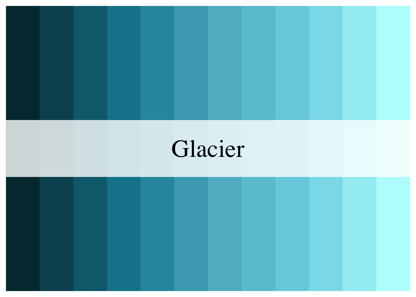
Using custom colors
You can use any kind of custom colors using the scale_color or scale_fill functions.
In this example, the colors come from the NatParksPalettes package. If you are using palettes from a color palette package, you will need to do some extra work to make sure you use the palette you want and generate new colors from the palette to match the number of levels in your categorical variable.
For example, there are 12 months so you would need 12 colors. The Glacier palette only has 5 colors in it. Thus, the arguments would be:
Code
NatParksPalettes::natparks.pals(name ="Glacier", # palette namen =12, # number of colorstype ="continuous") # naming a continuous palette to force new colors to be generated
Then, you would have 12 additional colors:
The hex codes for those colors are:
Code
NatParksPalettes::natparks.pals(name ="Glacier", n =12, type ="continuous") |>as.character()
---title: "Finalizing plots"description: "tips for making your plots readable and professional"categories: [data visualization]format: html: code-fold: true---# Why do we care about how plots, figures, graphs, etc. look?Data visualization is a _huge_ part of data storytelling, one of the core parts of being a data scientist. This is _especially_ relevant to environmental science: you're responsible for communicating not just about the environment, but what evidence (i.e. data) supports your claim. Therefore, it is crucial that environmental scientists communicate about their data clearly and effectively. In this class, your plots will be assessed using three (very broad) criteria: 1. **accuracy**: is your plot accurately and _truthfully_ representing the data? 2. **clarity**: is your plot clearly representing a pattern, relationship, message? 3. **aesthetics**: does your plot look good? # General rules for good-looking plots_(adapted from Allison Horst)_## Non-negotiable (if you are missing these, you will not get full credit for your plot)- Axes must have **complete** labels with units (very few exceptions to this) - for example: body_mass_g should be "Body mass (g)"- Underlying data must always be shown if there is any summary (e.g. mean or median) or model prediction shown- Underlying data should be displayed in such a way that points can be distinguished (you can do this with transparency and/or modifying the shape type)- Colors must be different from the `ggplot` defaults- theme must be different from the `ggplot` defaults- your plot size should allow for all components of your plot (title, axis text, legend, etc.) to be visible and readable## Additional points - logical start and end values of x or y axes (these are usually by default in `ggplot`, but you should double check)- text labels should be large enough to see/read clearly- be aware of color-blind friendly color palettes- use one font throughout a plotIn general, **the simpler you can make a plot, the better.**# Bad/better examplesSome examples of bad and better plots follow using data from the `{lterdatasampler}` package.```{r}#| message: false#| echo: falselibrary(lterdatasampler)library(tidyverse)```## Bar chart```{r fig.width = 8, fig.height = 6}and_vertebrates |> # filter for cutthroat trout and cascade/pool/side channel/rapid location filter(species == "Cutthroat trout" & unittype %in% c("C", "P", "SC", "R")) |> # group by location group_by(unittype) |> # count number of observations count() |> # plot bar chart of number of observations by unittype ggplot(mapping = aes(x = unittype, y = n)) + geom_col() ```**Why is this bad?** - gap between bottom of bars and x-axis - meaningless y axis - gray background against gray bars and black text is hard to see - gridlines don't do much```{r fig.width = 8, fig.height = 6, warning = FALSE}and_vertebrates |> # same filtering and summarizing steps as above filter(species == "Cutthroat trout" & unittype %in% c("C", "P", "SC", "R")) |> group_by(unittype) |> count() |> ungroup() |> # mutating unittype column to have full names of locations mutate(unittype = recode_values( unittype, "C" ~ "Cascade", "P" ~ "Pool", "SC" ~ "Side channel", "R" ~ "Rapid" )) |> # plot bar chart of number of observations by unittype # reorder() in aes() reorders x-axis in order of descending n (count) ggplot(mapping = aes(x = reorder(unittype, -n), y = n)) + geom_col(fill = "lightblue4", color = "#000000") + # expand takes away the gap at the bottom and at the top of the plot # limits sets the limits of the axis scale_y_continuous(expand = c(0, 0), limits = c(0, 12000)) + # change titles to be meaningful labs(x = "Sampling location", y = "Count", title = "Number of Cutthroat trout observations differs across sampling locations") + # one of the built-in themes in ggplot theme_bw() + theme(# changing text sizes axis.text = element_text(size = 12), axis.title = element_text(size = 14), strip.text = element_text(size = 14), # getting rid of gridlines panel.grid = element_blank(), # making the plot title bigger and centering it plot.title = element_text(size = 20, hjust = 0.5), plot.title.position = "plot", text = element_text(family = "Garamond") ) ```**Why is this better?** - text is bigger - gridlines are gone (because the theme is different from the default) - easier to see columns against background - complete axes - x-axis labels are complete ("Cascade" instead of "C")- fill is different from default (demonstrates some level of customization)- x-axis is reordered so that the differences across groups are easier to see## Scatterplot```{r fig.width = 8, fig.height = 6, warning = FALSE}knz_bison |> # calculate age of individual mutate(age = rec_year - animal_yob) |> # plotting weight as a function of age ggplot(mapping = aes(x = age, y = animal_weight)) + # scatterplot geom_point()```**Why is this bad?** - grey background, black dots - hides some meaningful variation across sexes (male bison tend to be larger than female bison, but female bison tend to live longer) - axes are meaningless - small text size - points likely overlap, so some parts of the data are hidden```{r fig.width = 8, fig.height = 6, warning = FALSE}knz_bison |> # calculate age of individual mutate(age = rec_year - animal_yob) |> # plotting weight as a function of age # coloring and shaping points by sex (male or female) ggplot(mapping = aes(x = age, y = animal_weight, color = animal_sex, shape = animal_sex)) + # scatterplot # points are transparent and large geom_point(alpha = 0.4, size = 2) + # manually setting open shapes and colors scale_shape_manual(values = c(21, 24)) + scale_color_manual(values = c("darkgreen", "cornflowerblue")) + # relabelling axes and legend title labs(x = "Bison age", y = "Recorded weight (lbs)", color = "Sex", shape = "Sex") + # another ggplot built-in theme theme_classic() + theme(# putting legend in plot area legend.position = c(0.85, 0.85), # legend text sizes legend.text = element_text(size = 14), legend.title = element_text(size = 14), # text size, position, and font adjustment axis.text = element_text(size = 14), axis.title = element_text(size = 16), plot.title = element_text(size = 18, hjust = 0.5), plot.title.position = "plot", text = element_text(family = "Garamond") )```**Why is this better?** - white background, no grid lines - points are shaped and colored by sex (and larger overall), so you can easily see the differences between groups - transparency shows overlapping points - complete axis labels - text is larger and font is changed - legend is in plot area (if there's space to do this, generally good)## Boxplots```{r fig.width = 8, fig.height = 6, warning = FALSE}arc_weather |> # extracting month from date column mutate(month = month(date, label = TRUE)) |> # filtering to only include dates from 2018 filter(date > as.Date("2017-12-31")) |> # plotting mean daily air temperature ggplot(mapping = aes(x = month, y = mean_airtemp)) + # boxplot (shows median mean daily air temperature) geom_boxplot()```**Why is this bad?** - grey background, black dots - doesn't show the underlying data - y-axis is meaningless - small text size ```{r}#| fig-width: 8#| fig-height: 6arc_weather |># extracting month from date columnmutate(month =month(date, label =TRUE)) |># filtering to only include dates from 2018filter(date >as.Date("2017-12-31")) |># plotting mean daily air temperature# coloring and filling by monthggplot(mapping =aes(x = month,y = mean_airtemp,fill = month,color = month)) +# make the boxplots narrower# take out outliers (redundant if you are showing underlying data)# making the outlines black so that they are easier to seegeom_boxplot(width =0.2,outliers =FALSE,color ="black") +# showing the underlying data# making sure the points aren't jittered along the y-axisgeom_jitter(alpha =0.5,height =0,width =0.4) +# specify the colors you want to use for each monthscale_fill_manual(values = NatParksPalettes::natparks.pals(name ="Glacier",n =12,type ="continuous")) +scale_color_manual(values = NatParksPalettes::natparks.pals(name ="Glacier",n =12,type ="continuous")) +# relabel the axis titles, plot title, and captionlabs(x ="Month", y ="Air temperature (\U00B0 C)",title ="Monthly temperatures at Toolik Field Station, Alaska") +# themes built in to ggplottheme_bw() +# other theme adjustmentstheme(legend.position ="none", axis.title =element_text(size =13),axis.text =element_text(size =12),plot.title =element_text(size =14),plot.title.position ="plot",plot.caption =element_text(face ="italic"),text =element_text(family ="Times New Roman"),panel.grid =element_blank())```**Why is this better?** Same points as above for the scatterplot, with some additional points: - title position is over the y-axis to provide some visual balance (a long title hanging over the end of the x-axis can be visually imbalanced)- legend is taken out (because it's redundant with the x-axis):::{.callout-note title="Using custom colors" collapse="true"}You can use any kind of custom colors using the `scale_color` or `scale_fill` functions. In this example, the colors come from the `NatParksPalettes` package. If you are using palettes from a color palette package, you will need to do some extra work to make sure you use the palette you want and generate new colors from the palette to match the number of levels in your categorical variable. For example, there are 12 months so you would need 12 colors. The `Glacier` palette only has 5 colors in it. Thus, the arguments would be:```{r}#| eval: falseNatParksPalettes::natparks.pals(name ="Glacier", # palette namen =12, # number of colorstype ="continuous") # naming a continuous palette to force new colors to be generated```Then, you would have 12 additional colors:```{r}#| echo: falseNatParksPalettes::natparks.pals(name ="Glacier", # palette namen =12, # number of colorstype ="continuous") # naming a continuous palette to force new colors to be generated```The hex codes for those colors are:```{r}NatParksPalettes::natparks.pals(name ="Glacier", n =12, type ="continuous") |>as.character()```:::